Pressable CSS3 Social Buttons
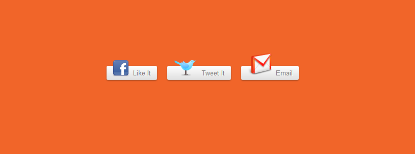
| Pressable CSS3 Social Buttons inspired by a tutorial on Nettuts. These buttons uses simple CSS3 properties like gradients, box-shadows, text-shadows etc. Hover and active states are also included in this set. The icons on the button can be changed easily and these buttons can be serverd as a template so you can create any type of social button from it, you just need the right icon. These can be used in real world applications and they even degrade nicely in Internet Explorers. HTML Code <div class="container"> <span class="button fb"> <a href="#"><img src="http://png-1.findicons.com/files/icons/2052/social_network/32/facebook.png" alt="">Like It</a> </span> <span class="button twit"> <a href="#"><img src="http://png-4.findicons.com/files/icons/2192/flavour_extended/48/twitter_standing.png" alt="">Tweet It</a> </span> <span class="button mail"> <a href="#"><img src="http://png-1.findicons.com/files/icons/1696/once/48/mail.png" alt="">Email</a> </span> </div> CSS Code body { background: #f1f1f1; } a{ text-decoration: none; color:#333333; } .container{ width: 420px; margin: 50px auto 50px; /* buttons pushed from the top by 10% */ } .button{ margin: 8px; } .button a{ font-family: arial, sans-serif; font-size: 13px; color: #777; text-shadow: 1px 1px 0px white; background: #ffffff; /* Old browsers */ background: -moz-linear-gradient(top, #ffffff 0%, #dfdfdf 100%); /* FF3.6+ */ background: -webkit-gradient(linear, left top, left bottom, color-stop(0%,#ffffff), color-stop(100%,#dfdfdf)); /* Chrome,Safari4+ */ background: -webkit-linear-gradient(top, #ffffff 0%,#dfdfdf 100%); /* Chrome10+,Safari5.1+ */ background: -o-linear-gradient(top, #ffffff 0%,#dfdfdf 100%); /* Opera11.10+ */ background: -ms-linear-gradient(top, #ffffff 0%,#dfdfdf 100%); /* IE10+ */ filter: progid:DXImageTransform.Microsoft.gradient( startColorstr='#ffffff', endColorstr='#dfdfdf',GradientType=0 ); /* IE6-9 */ background: linear-gradient(top, #ffffff 0%,#dfdfdf 100%); /* W3C */ -moz-border-radius: 3px; -webkit-border-radius: 3px; border-radius: 3px; -moz-box-shadow: 0 1px 3px 0px rgba(0,0,0,0.4); -webkit-box-shadow: 0 1px 3px 0px rgba(0,0,0,0.4); box-shadow: 0 1px 3px 0px rgba(0,0,0,0.4); padding: 6px 12px; } .button a:hover{ background: #ffffff; /* Old browsers */ background: -moz-linear-gradient(top, #ffffff 0%, #eee 100%); /* FF3.6+ */ background: -webkit-gradient(linear, left top, left bottom, color-stop(0%,#ffffff), color-stop(100%,#eee)); /* Chrome,Safari4+ */ background: -webkit-linear-gradient(top, #ffffff 0%,#eee 100%); /* Chrome10+,Safari5.1+ */ background: -o-linear-gradient(top, #ffffff 0%,#eee 100%); /* Opera11.10+ */ background: -ms-linear-gradient(top, #ffffff 0%,#eee 100%); /* IE10+ */ filter: progid:DXImageTransform.Microsoft.gradient( startColorstr='#ffffff', endColorstr='#eee',GradientType=0 ); /* IE6-9 */ background: linear-gradient(top, #ffffff 0%,#eee 100%); /* W3C */ -moz-box-shadow: 0 1px 3px 0px rgba(0,0,0,0.4); -webkit-box-shadow: 0 1px 3px 0px rgba(0,0,0,0.4); box-shadow: 0 1px 3px 0px rgba(0,0,0,0.4); } .button a:active{ background: #dfdfdf; /* Old browsers */ background: -moz-linear-gradient(top, #dfdfdf 0%, #f1f1f1 100%); /* FF3.6+ */ background: -webkit-gradient(linear, left top, left bottom, color-stop(0%,#dfdfdf), color-stop(100%,#f1f1f1)); /* Chrome,Safari4+ */ background: -webkit-linear-gradient(top, #dfdfdf 0%,#f1f1f1 100%); /* Chrome10+,Safari5.1+ */ background: -o-linear-gradient(top, #dfdfdf 0%,#f1f1f1 100%); /* Opera11.10+ */ background: -ms-linear-gradient(top, #dfdfdf 0%,#f1f1f1 100%); /* IE10+ */ filter: progid:DXImageTransform.Microsoft.gradient( startColorstr='#dfdfdf', endColorstr='#f1f1f1',GradientType=0 ); /* IE6-9 */ background: linear-gradient(top, #dfdfdf 0%,#f1f1f1 100%); /* W3C */ -webkit-box-shadow: 0px 1px 1px 1px rgba(0,0,0,0.2) inset, 0px 1px 1px 0 rgba(255,255,255,1); -moz-box-shadow: 0px 1px 1px 1px rgba(0,0,0,0.2) inset, 0px 1px 1px 0 rgba(255,255,255,1); box-shadow: 0px 1px 1px 1px rgba(0,0,0,0.2) inset, 0px 1px 1px 0 rgba(255,255,255,1); } .button a > img{ padding-right: 8px; position: relative; top: 2px; } | |
| | |
Views: 1274 | Rating: 0.0/0 |
