Bold and Beautiful Drop-Down Navigation Menu
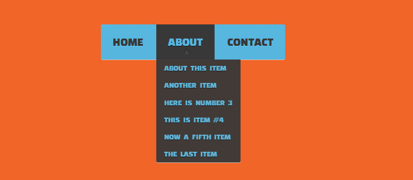
| Very beautiful and bold looking navigation menu created by Jordan Austin. This menu is two level and has some pretty cool animation effects achieved by using transition property of CSS3 when the link or menu is hovered. The dropdown menu is initially hidden by setting its visibility property to hidden and opacity to 0. When the link is hovered, the visibility is set to visible and the opacity to 1 with some changes in position to make the animation better. Take a look at the code to understand what's happening here. HTML Code <title>demo dropdown menu</title> <link rel="stylesheet" href="cssdd.css"> <!--[if lte IE 8]> <style> .nav{ font-size: 86%; font-weight: bolder;} .nav > ul > li { display: inline; zoom: 1;} .dropdown > li { min-width: inherit;} </style> <![endif]--> <link href='http://fonts.googleapis.com/css?family=Changa+One' rel='stylesheet' type='text/css'> </head> <body> <div class="nav"><!-- change this to just <nav> if you don't want it to work on old IE --> <ul> <li><a href="#home">home</a></li> <li class="parent"><a href="#about">about</a> <ul class="dropdown"> <li><a href="#about/1">about this item</a></li> <li><a href="#about/2">another item</a></li> <li><a href="#about/3">here is number 3</a></li> <li><a href="#about/4">this is item #4</a></li> <li><a href="#about/5">now a fifth item</a></li> <li><a href="#about/6">the last item</a></li> </ul> </li> <li><a href="#contact">contact</a></li> </ul> </div> </body> CSS Code /*THE MINIFIED RESET*/ html, body, div, span, applet, object, iframe, h1, h2, h3, h4, h5, h6, p, blockquote, pre, a, abbr, acronym, address, big, cite, code, del, dfn, em, img, ins, kbd, q, s, samp, small, strike, strong, sub, sup, tt, var, b, u, i, center, dl, dt, dd, ol, ul, li, fieldset, form, label, legend, table, caption, tbody, tfoot, thead, tr, th, td, article, aside, canvas, details, embed, figure, figcaption, footer, header, hgroup, menu, nav, output, ruby, section, summary, time, mark, audio, video { margin: 0; padding: 0; border: 0; font-size: 100%; font: inherit; vertical-align: baseline; } /* HTML5 display-role reset for older browsers*/ article, aside, details, figcaption, figure, footer, header, hgroup, menu, nav, section { display: block; } body { line-height: 1; } ol, ul { list-style: none; } blockquote, q { quotes: none; } blockquote:before, blockquote:after, q:before, q:after { content: ''; content: none; } table { border-collapse: collapse; border-spacing: 0; } /*self clearfixing*/ section:before, section:after, article:before, article:after {clear: both; content: ""; display: table;} /* new clearfix */ .clearfix:after { visibility: hidden; display: block; font-size: 0; content: " "; clear: both; height: 0; } * html .clearfix { zoom: 1; } /* IE6 */ *:first-child+html .clearfix { zoom: 1; } /* IE7 */ /*END RESET*/ body{ background: url(http://dl.dropbox.com/u/10339449/noise_pattern_with_crosslines.png) repeat; } .nav { position: relative; z-index: 5; width: 376px; min-width: 376px; max-width: 500px; margin: 100px auto; font-family: 'Changa One', helvetica, arial, sans-serif; -webkit-border-radius: 3px; -moz-border-radius: 3px; border-radius: 3px; background: rgb(87,183,223); background: -moz-linear-gradient(top, rgb(87,183,223) 0%, rgb(87,181,222) 100%); background: -webkit-gradient(linear, left top, left bottom, color-stop(0%,rgb(87,183,223)), color-stop(100%,rgb(87,181,222))); background: -webkit-linear-gradient(top, rgb(87,183,223) 0%,rgb(87,181,222) 100%); background: -o-linear-gradient(top, rgb(87,183,223) 0%,rgb(87,181,222) 100%); background: -ms-linear-gradient(top, rgb(87,183,223) 0%,rgb(87,181,222) 100%); background: linear-gradient(top, rgb(87,183,223) 0%,rgb(87,181,222) 100%); -webkit-box-shadow: 0px 1px 0px 0px #cccccc; -moz-box-shadow: 0px 1px 0px 0px #cccccc; box-shadow: 0px 1px 0px 0px #cccccc; } .nav li { display: inline-block; } .nav a { display: block; text-transform:uppercase; font-family: 'Changa One', helvetica, arial, sans-serif; font-size: 1.5em; color: rgb(56,56,56); text-decoration: none; padding: 1em; text-shadow: 0px 1px 0px #63d0ff; } .nav > ul > li:hover > a{ color: rgb(87,183,223); text-shadow: 0px 1px 0px #050505; background: rgb(56,56,56); } .nav > ul > li:first-child:hover a{ -webkit-border-radius: 3px 0 0 3px; -moz-border-radius: 3px 0 0 3px; border-radius: 3px 0 0 3px; } .nav > ul > li:last-child:hover a{ -webkit-border-radius: 0 3px 3px 0; -moz-border-radius: 0 3px 3px 0; border-radius: 0 3px 3px 0; } /*DROPDOWN*/ .parent{ position: relative; } .parent:after { content: ' \25bc'; position: absolute; margin: -1.5em 0 0 45%; color: rgb(90,187,229); text-shadow: 0px 1px 0px #4c9ec2; } .parent:hover:after { content: ' \25b2'; color: rgb(70,70,70); text-shadow: 0px -1px 0px #000000; } .dropdown { position:absolute; list-style:none; opacity: 0; visibility: hidden; margin-top: 4px; -webkit-border-radius: 0 0 3px 3px; -moz-border-radius: 0 0 3px 3px; border-radius: 0 0 3px 3px; -webkit-box-shadow: 0px 1px 0px 0px #cccccc; -moz-box-shadow: 0px 1px 0px 0px #cccccc; box-shadow: 0px 1px 0px 0px #cccccc; background: rgb(56,56,56); -webkit-transition: all .24s ease; -moz-transition: all .24s ease; -ms-transition: all .24s ease; -o-transition: all .24s ease; transition: all .24s ease; } .nav li:hover .dropdown{ display: block; margin:0; opacity: 1; visibility: visible; } .dropdown li{ display: block; } .dropdown a { display: block; padding: 0.6em 1em 0.6em 1em; text-transform:uppercase; font-size: 1em; word-spacing: 0.3em; white-space:nowrap; color: rgb(87,183,223); text-shadow: 0px 1px 0px #050505; } .dropdown li:hover a{ color: rgb(56,56,56); text-decoration: none; text-shadow: 0px 1px 0px #63d0ff; background: rgb(87,183,223); background: -moz-linear-gradient(top, rgb(87,181,222) 0%, rgb(87,183,223) 100%); background: -webkit-gradient(linear, left top, left bottom, color-stop(0%,rgb(87,181,222)), color-stop(100%,rgb(87,183,223))); background: -webkit-linear-gradient(top, rgb(87,181,222) 0%,rgb(87,183,223) 100%); background: -o-linear-gradient(top, rgb(87,181,222) 0%,rgb(87,183,223) 100%); background: -ms-linear-gradient(top, rgb(87,181,222) 0%,rgb(87,183,223) 100%); background: linear-gradient(top, rgb(87,181,222) 0%,rgb(87,183,223) 100%); } .dropdown > li:last-child:hover a{ -webkit-border-radius: 0 0 3px 3px; -moz-border-radius: 0 0 3px 3px; border-radius: 0 0 3px 3px; } | |
| | |
Views: 2182 | Rating: 0.0/0 |

asdasd
Android On/Off Switch Button
Posted by altayhasanlipro in Articles
Facebook Login Form
Posted by altayhasanlipro in Articles
Bold and Beautiful Drop-Down Navigation Menu
Posted by altayhasanlipro in Articles
Checkout Form
Posted by altayhasanlipro in Articles
Download Buttons
Posted by altayhasanlipro in Articles
Bold and Beautiful Drop-Down Navigation Menu
Posted by altayhasanlipro in Articles
Checkout Form
Posted by altayhasanlipro in Articles
Facebook Login Form
Posted by altayhasanlipro in Articles
3D Buttons
Posted by altayhasanlipro in Articles
Different CSS3 Box Shadows Effects
Posted by altayhasanlipro in Articles
Download Buttons
Posted by altayhasanlipro in Articles
Checkout Form
Posted by altayhasanlipro in Articles
Facebook Login Form
Posted by altayhasanlipro in Articles
3D Buttons
Posted by altayhasanlipro in Articles
Different CSS3 Box Shadows Effects
Posted by altayhasanlipro in Articles
Poll
Category