Metro Radios
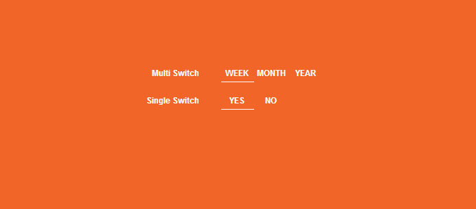
| Metro style radio buttons CSS3 Only! HTML Code <div class="container"> <div class="row pad-btm-40"> <!-- START tabs --> <div class="span16"> <div class="spaceEmOut"> <fieldset class="switch switch-three"> <legend>Multi Switch</legend> <input id="week4" name="view4" type="radio" checked /> <label for="week4">WEEK</label> <input id="month4" name="view4" type="radio" /> <label for="month4">MONTH</label> <input id="year4" name="view4" type="radio" /> <label for="year4">YEAR</label> <span class="switch-button"></span> </fieldset> </div> <div class="spaceEmOut"> <fieldset class="switch switch-two"> <legend>Single Switch</legend> <input id="yes" name="view" type="radio" checked /> <label for="yes">YES</label> <input id="no" name="view" type="radio" /> <label for="no">NO</label> <span class="switch-button"></span> </fieldset> </div> </div> </div> </div> <!-----------------------> <div class="victorknust">Simple and Impactful Creative Solutions | <a href="http://cssdeck.com/user/victorknust" target="_blank">Victor knust</a></div> CSS Code @media only screen { .toggle { color: #fff; display: block; font-family: sans-serif; font-size: 12px; font-weight: bold; margin: 0; padding: 0; position: relative; width: 200px; } .toggle label { display: block; padding: 3px 0; position: relative; width: 100%; z-index: 3; } .toggle input { opacity: 0; position: absolute; z-index: 5; } .toggle input:focus ~ .toggle-button { outline: 1px dotted #6B6B6B; } .switch { border: 0; color: #fff; font-family: sans-serif; font-size: 12px; font-weight: bold; padding: 0; position: relative; width: 300px; } .switch legend { color: #6B6B6B; display: block; float: left; font-size: 12px; line-height: 15px; padding: 7px 10% 3px 0; text-align: right; width: 40%; } .switch input { opacity: 0; position: absolute; } .switch legend:after { border-radius: 3px; content: ''; height: 100%; left: 50%; padding: 2px; position: absolute; top: 0; width: 50%; z-index: 0; } .switch label { color: #DEDEDE; cursor: pointer; float: left; margin-top: 2px; padding: 5px 0 3px 0; position: relative; text-align: center; width: 25%; z-index: 2; } .switch input:checked + label { color: #6B6B6B; moz-transition: all 0.4s ease-in 0s; o-transition: all 0.4s ease-in 0s; transition: all 0.4s ease-in 0s; webkit-transition: all 0.4s ease-in 0s; } .switch input:focus + label { background-color: #EDEDED; moz-transition: all 0.4s ease-in 0s; o-transition: all 0.4s ease-in 0s; transition: all 0.4s ease-in 0s; webkit-transition: all 0.4s ease-in 0s; } .switch .switch-button { border-bottom: solid 1px #6B6B6B; clear: both; height: 100%; left: 50%; margin: 2px; moz-transition: all 0.3s ease-out; o-transition: all 0.3s ease-out; position: absolute; top: 0; transition: all 0.3s ease-out; webkit-transition: all 0.3s ease-out; z-index: 1; } .switch input:last-of-type:checked ~ .switch-button { left: 75%; } .switch.switch-two label { width: 16.6%; } .switch.switch-two .switch-button { width: 16%; } .switch.switch-two input:checked:nth-of-type(2) ~ .switch-button { left: 66.6%; } .switch.switch-two input:checked:last-of-type ~ .switch-button { left: 66.26%; } .switch.switch-three label { width: 16.6%; } .switch.switch-three .switch-button { width: 16%; } .switch.switch-three input:checked:nth-of-type(2) ~ .switch-button { left: 66.6%; } .switch.switch-three input:checked:last-of-type ~ .switch-button { left: 83.26%; } .switch.fcRed .switch-button { border-bottom: solid 1px red; } .switch.fcRed input:checked + label { color: red; } } .spaceEmOut { margin-bottom: 15px; } body { padding: 50px } /*****************************************/ .victorknust { font-size: 11px; text-align: center; position: fixed; bottom:20px; right: 50px; } a:link, a:visited, a:active { color: #333; text-decoration: none; padding: 1px; background: yellow; } | |
| | |
Views: 863 | Rating: 0.0/0 |
